
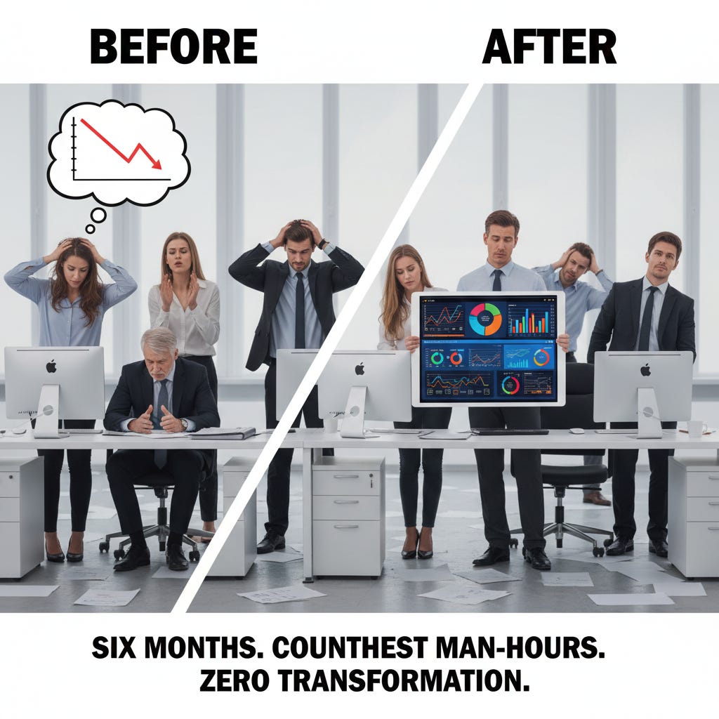
The Work Before and After: Why Most Analysis Creates Zero Value
You’ve gotten good at the work. Your SQL is clean. Your dashboards are polished. You can pull data, transform it, visualize it................

There’s a moment in every analyst’s career where something puzzling happens.
You’ve gotten good at the work. Your SQL is clean. Your dashboards are polished. You can pull data, transform it, visualize it, and deliver it on deadline. By every measure that bootcamps and job descriptions care about, you’re performing.
And yet, your work seems to vanish into a void.
The dashboards you built get bookmarked and forgotten. The analyses you delivered get polite nods in meetings and then nothing changes. You produce artifact after artifact each one technically correct and somehow the organization makes the same decisions it would have made without you.
Meanwhile, you notice something about the analysts who seem to matter. They’re not necessarily more technical than you. Their SQL isn’t fancier. Their dashboards aren’t prettier. But when they speak, executives listen. When they deliver analysis, things actually change.
What’s going on?
The answer, I’ve come to believe, lies in an invisible structure that most analysts never see. It’s called the Analytics Value Chain and understanding it reveals why most analytical work, no matter how technically sound, creates zero business value.
This essay is about that structure. Once you see it, you’ll understand why you’ve been working hard in the wrong places.
What the Value Chain Actually Means
Let me be clear about what I’m not going to do: I’m not going to give you a management consultant’s framework full of boxes and arrows. Those have their place, but they’re not where understanding begins.
Here’s what the Analytics Value Chain actually means in practice:
Analysis only creates value when it changes a decision. The chain is everything that has to happen before and after the analysis itself to make that change possible.
That’s it. That’s the fundamental insight.
Most analysts think their job is to produce analysis. It’s not. Their job is to change decisions. The analysis is just the mechanism and it’s not even the most important part of the mechanism.
Let me show you what I mean with three analogies, because this concept is worth approaching from multiple angles.
The Restaurant Analogy
Think about what it takes to run a successful restaurant.
There’s the cooking the part everyone pictures when they think of a restaurant. The chef in the kitchen, flames rising, plates being assembled with precision. This is the visible, glamorous work. This is what cooking shows focus on. This is what draws people to culinary careers.
But cooking is maybe 30% of what makes a restaurant successful.
Before the cooking happens, someone has to decide what should be on the menu. Not just “what tastes good” but “what will our customers pay for? What ingredients can we source reliably? What dishes can our kitchen execute consistently at volume? What price points work for our location?” This is menu planning and sourcing the work before the cooking.
After the cooking happens, someone has to actually deliver the food to customers in a way that creates a great experience. The plating, the timing, the server’s explanation of the dish all of this determines whether a technically perfect meal actually satisfies the customer. And then someone has to track whether the restaurant is profitable, which dishes are winners and losers, whether the reviews are positive, whether customers return.
A restaurant that only focuses on the cooking that ignores menu planning and sourcing on the front end, that ignores service and profitability on the back end fails. It might have a brilliant chef producing exquisite food that nobody ordered, that can’t be sourced consistently, that takes too long to serve, that doesn’t generate profit.
This is exactly what most analysts do.
They focus on the analysis the equivalent of cooking. They ignore everything before the analysis (understanding what questions actually matter, ensuring data exists and is trustworthy) and everything after (communicating findings in ways that land, demonstrating financial impact).
And then they wonder why their work doesn’t seem to matter.
The Film Production Analogy
Let me approach this from another angle.
Think about what it takes to create a successful film.
There’s the shooting cameras rolling, actors performing, directors calling action. This is what people picture when they think about making movies. This is what film schools romanticize. This is the visible, exciting work.
But shooting is maybe 20% of what makes a film successful.
Before shooting begins, there’s development and pre-production. Someone has to write a script that’s actually worth filming. Someone has to secure financing. Someone has to cast the right actors, scout locations, plan the shooting schedule, assemble the crew. A film that starts shooting without solid pre-production is almost guaranteed to fail—over budget, behind schedule, creatively compromised.
After shooting ends, there’s post-production and distribution. The raw footage has to be edited into a coherent story. Sound has to be mixed. Visual effects have to be added. And then—crucially—the film has to actually reach audiences. Marketing, distribution deals, release strategy. The most brilliantly shot film in history creates zero value if nobody sees it.
A production company that only focuses on the shooting that rushes pre-production and ignores distribution—produces films that never get made or never get seen.
Now think about how most analysts work.
They jump straight to the shooting pulling data, building dashboards, running analyses. They skip pre-production (understanding what questions matter, aligning with stakeholders, verifying data quality). They ignore distribution (communicating findings effectively, ensuring insights reach decision-makers, demonstrating business impact).
They’re producing films that never get seen.
The Medical Care Analogy
One more analogy, because this point is the foundation of everything else.
Think about what it takes to actually heal a patient.
There’s the diagnosis and treatment the part everyone pictures when they think of medicine. The doctor examining symptoms, ordering tests, prescribing medication or performing surgery. This is the core medical work.
But diagnosis and treatment, without everything else, often fails.
Before diagnosis can happen, there’s intake and history. The doctor needs to understand the patient’s background, previous conditions, current medications, lifestyle factors. A doctor who skips intake and jumps straight to diagnosis will miss critical context. They’ll treat symptoms without understanding causes. They’ll prescribe medications that interact badly with existing ones.
After treatment, there’s follow-up and outcomes. Did the treatment work? Is the patient recovering? Are there side effects to manage? Does the treatment plan need adjustment? And ultimately—is the patient actually healthier? A doctor who never follows up has no idea whether their work helped.
A medical practice that only focuses on the diagnosis and treatment—that rushes intake and ignores follow-up will have patients who don’t get better, who don’t trust their doctors, who don’t come back.
This is the pattern.
Restaurants, films, medicine all share the same structure. There’s the core work that everyone focuses on. And there’s the work before and after that determines whether the core work actually creates value.
Analytics is no different.
The Six Phases Nobody Talks About
Now let me show you the actual structure of the Analytics Value Chain.
There are six phases. Most analysts operate in phases three and four. They’ve never even heard of phases one, two, five, and six.
Phase One: Understanding What to Analyze
Before any query is written, someone needs to answer: What are we actually trying to figure out, and why does it matter?
This isn’t about understanding the data request. It’s about understanding the business context that generated the request. What decision will this analysis inform? What happens if we find X versus Y? Who cares about the answer, and what will they do with it?
Phase Two: Collecting and Verifying Data
Before you can analyze data, you need to know whether the data exists, whether it’s accurate, and whether it’s structured in a way that makes analysis possible.
This involves data engineering, data modeling, data governance the infrastructure work that makes analysis feasible.
Phase Three: Building Dashboards and Reports
This is where most analysts live. Building the artifacts. Creating the visualizations. Producing the deliverables.
Phase Four: Analyzing and Communicating
Analysis beyond reporting. Answering business questions. Generating insights. Constructing narratives and presenting them to stakeholders.
Phase Five: Optimizing and Predicting
Advanced analytics. Moving from “what happened” to “what might happen” to “what should we do.”
Phase Six: Demonstrating Economic Value
Proving that the analytical work created financial value. Connecting insights to revenue increases or cost reductions.
The Phases That Get Skipped
Here’s what I’ve observed across dozens of analytics teams.
Most analysts spend 90% of their time in phases three and four building and analyzing.
They spend almost no time in phase one understanding what to analyze.
They treat phase two data quality and governance as someone else’s problem.
They consider phases five and six prediction and value demonstration as optional extras they’ll get to someday.
This distribution is exactly backwards.
Let me show you what happens when the bookend phases get skipped.
The Before Problem: An Example
A marketing director sends a request to the analytics team:
“Can you build me a dashboard showing campaign performance by channel? I need to see impressions, clicks, conversions, and ROAS for each campaign.”
Here’s how most analysts handle this request:
They open their BI tool. They connect to the marketing data sources. They build a dashboard with impressions, clicks, conversions, and ROAS by campaign. They add some filters for date range and channel. They send it to the marketing director. Done.
Technically correct. Professionally useless.
Here’s what a Phase One analyst would do instead:
Before building anything, they’d ask:
“Help me understand what you’re trying to decide. Are you looking to reallocate budget between channels? Identify underperforming campaigns to cut? Justify your current spend to leadership? Something else?”
The marketing director says: “I need to decide which campaigns to cut if we have to reduce budget by 20% next quarter.”
Now the analyst understands the actual business question. And they realize that a standard performance dashboard won’t answer it.
Cutting campaigns isn’t just about current ROAS. It’s about:
Which campaigns are still ramping up versus mature
Which campaigns drive new customer acquisition versus retention
What the incrementality of each campaign is would those conversions have happened anyway?
What the downstream impact on lifetime value is, not just immediate conversion
The analyst comes back:
“A standard performance dashboard won’t tell you which campaigns to cut. Let me build something different a scenario analysis that shows projected impact of cutting different combinations of campaigns, accounting for incrementality and customer lifetime value. That’s what you actually need to make this decision.”
Same request. Completely different outcome.
The Phase One analyst didn’t just build what was requested. They understood what decision needed to be made, and built what was actually needed.
This is the work before the work. And it’s the work almost everyone skips.
What Phase One Actually Looks Like on Paper
Let me show you the difference between how most analysts document a project and how a Phase One analyst documents it.
❌ Typical Analyst Intake:
textProject: Marketing Dashboard
Requestor: Sarah (Marketing Director)
Request: Campaign performance dashboard with impressions,
clicks, conversions, ROAS by channel
Due Date: End of month
Data Sources: Google Ads, Facebook Ads, Salesforce
Status: In ProgressThis is what most ticket systems and project trackers capture. It documents the what—what was requested, when it’s due, where the data lives.
It tells you nothing about the why.
✅ Phase One Analyst Intake:
textProject: Marketing Budget Reallocation Analysis
Requestor: Sarah Chen, Marketing Director
Date: March 15, 2024
BUSINESS CONTEXT
────────────────────────────────────────
What decision will this inform?
→ Which campaigns to cut/reduce if Q3 budget is reduced by 20%
→ Secondary: Which channels deserve increased investment
Why is this decision being made now?
→ CFO signaled potential 20% marketing budget cut for Q3
→ Q2 planning deadline is April 30
→ Sarah needs defensible rationale for leadership
What happens if we find X vs Y?
→ If paid social underperforms: Reduce spend, reallocate to
organic/SEO investment
→ If paid social performs: Defend budget, potentially cut
lower-performing display campaigns
Who will act on this analysis?
→ Sarah makes recommendation to CMO
→ CMO presents to CFO
→ Final decision at Q2 planning meeting (April 25)
What does “good enough” look like?
→ Clear rank-order of campaigns by “cut priority”
→ Projected revenue impact of cutting each campaign
→ Defensible methodology Sarah can explain to CFO
ANALYTICAL APPROACH
────────────────────────────────────────
What this analysis IS:
→ Scenario modeling: impact of cutting various campaign
combinations
→ Incrementality-adjusted ROAS (not just last-touch)
→ Downstream LTV impact, not just immediate conversion
What this analysis IS NOT:
→ A standard performance dashboard (not what’s actually needed)
→ Real-time reporting (one-time decision support)
→ Attribution deep-dive (save for later)
Key assumptions to validate with stakeholder:
→ Are we including brand campaigns or just performance?
→ 90-day attribution window acceptable?
→ Should we account for seasonality in projections?
SUCCESS CRITERIA
────────────────────────────────────────
This project succeeds if:
→ Sarah can walk into April 25 meeting with clear
recommendation
→ CMO doesn’t ask for “more analysis” before deciding
→ Decision is made (not deferred) based on this work
This project fails if:
→ We deliver a dashboard that doesn’t answer the actual
question
→ Sarah still doesn’t know what to cut after reviewing
→ CFO challenges methodology and analysis gets re-litigatedSame request. Same stakeholder. One version takes 2 minutes to fill out. The other takes 30 minutes.
But the 30-minute version saves you 30 hours of building the wrong thing.
Look at what the Phase One document captures that the typical intake misses:
The actual decision (budget reallocation, not “visibility”)
The timeline and stakes (Q2 planning meeting, CFO involvement)
What changes based on findings (cut paid social vs. cut display)
What success looks like (decision made, not deferred)
What this analysis is NOT (prevents scope creep)
The Phase One document is a contract between you and the stakeholder. It aligns expectations before you write a single query. And it gives you something to point back to when scope creep happens or when someone asks why you didn’t include something.
Most analysts skip this work because it feels like overhead. It’s not overhead. It’s the foundation that determines whether everything you build afterward has value.
The After Problem: An Example
Let me show you the other bookend.
An analyst completes a sophisticated analysis of customer churn. They’ve identified the key predictors of churn, built a model that can flag at-risk customers 60 days before they leave, and calculated that intervening with these customers could save $2M in annual revenue.
This is genuinely valuable work.
Here’s what usually happens next:
The analyst presents the findings in a meeting. There are nods of appreciation. Someone says “this is really interesting.” The meeting ends. The analyst moves on to the next project.
Six months later, the churn model is still sitting in a notebook somewhere. Nobody implemented an intervention program. The $2M in potential savings never materialized.
The analysis was correct. The value was never realized.
Now here’s what Phase Six looks like:
After the initial presentation, the analyst doesn’t move on. They follow up:
“Have we implemented the intervention program for at-risk customers?”
“What’s the response rate to the intervention?”
“How many customers who were flagged as at-risk and received intervention have been retained?”
“What’s the dollar value of retention we can attribute to this model?”
They track the outcomes. They quantify the impact. And in the next budget cycle, when leadership asks “what has analytics actually delivered this year?” they have an answer.
“The churn intervention program, driven by our predictive model, retained 847 customers who would otherwise have left. Based on average customer lifetime value, that’s $1.8M in preserved revenue. The cost of building the model and running the intervention program was approximately $200K. Net impact: $1.6M.”
That’s not “interesting analysis.” That’s demonstrated business value.
That’s the work after the work. And almost nobody does it.
What Phase Six Actually Looks Like on Paper
Let me show you what value documentation looks like—and why almost nobody does it.
❌ Typical Project Closeout:
textProject: Customer Churn Prediction Model
Status: Complete
Deliverables:
- Churn prediction model (deployed to production)
- Documentation in Confluence
- Presentation delivered to Customer Success team
Date Completed: June 15, 2024This documents that the work happened. It says nothing about whether the work mattered.
✅ Phase Six Value Tracking:
textProject: Customer Churn Prediction Model
Completed: June 15, 2024
Value Review Date: December 15, 2024 (6-month follow-up)
IMPLEMENTATION TRACKING
────────────────────────────────────────
Was the recommendation implemented?
→ YES - Customer Success team launched intervention
program August 1
What specifically was implemented?
→ At-risk customers (model score >0.7) receive:
- Personal outreach call from CSM within 48 hours
- 20% renewal discount offer
- Priority support queue access
What was NOT implemented (and why)?
→ Automated email sequence (CS team preferred human touch)
→ Product usage nudges (engineering bandwidth unavailable)
OUTCOME MEASUREMENT
────────────────────────────────────────
Customers flagged as high-risk (Aug-Nov): 1,247
Customers who received intervention: 1,183 (95%)
→ 64 churned before intervention could occur
Retention outcomes for intervention group:
→ Retained: 847 (72%)
→ Churned despite intervention: 336 (28%)
Baseline comparison:
→ Historical retention rate for similar-risk customers
(no intervention): 41%
→ Intervention group retention rate: 72%
→ Lift: 31 percentage points
FINANCIAL IMPACT
────────────────────────────────────────
Customers retained due to intervention:
→ 847 retained - (1,183 × 0.41 baseline) = 362 incremental
saves
→ Conservative estimate (attributing only 50% to model):
181 saves
Revenue impact:
→ Average customer LTV: $8,400
→ Incremental retained revenue: 181 × $8,400 = $1,520,400
Cost of intervention program:
→ CSM time (estimated 2 hrs/customer × $75/hr): $177,450
→ Discount cost (avg $840 × 60% take rate): $601,562
→ Analytics team time (model + monitoring): $45,000
→ Total cost: $824,012
Net impact:
→ $1,520,400 - $824,012 = $696,388 net value created
ROI: 85%
LEARNINGS
────────────────────────────────────────
What worked:
→ Model accurately identified at-risk customers (precision
validated)
→ Human outreach more effective than expected
→ 48-hour response window was achievable for CS team
What didn’t work:
→ Discount take rate lower than projected (60% vs 80%
expected)
→ Some false positives frustrated healthy customers
→ Model performance degraded slightly in Month 4 (needs
retraining)
Recommendations for next iteration:
→ Retrain model quarterly with recent data
→ Add “confidence tier” to reduce false positive outreach
→ Test automated sequence for medium-risk tierThis is uncomfortable documentation.
Notice what it forces you to confront:
Not everything was implemented. The automated email sequence and product nudges never happened. That’s okay but you have to acknowledge it.
The math is conservative. I only attributed 50% of the retention lift to the model. Someone could argue it should be higher or lower. But at least there’s a number.
There were failures. The discount take rate was lower than projected. Some healthy customers got flagged. The model needs retraining. These aren’t failures of the analysis they’re learnings that improve the next iteration.
There’s a dollar figure. $696,388 in net value created. That’s a number you can bring to a budget meeting. That’s a number that protects your headcount.
Most analysts never create this document because:
It’s extra work after the project is “done”
It requires admitting what didn’t work
It forces you to commit to numbers that could be challenged
Nobody asks for it
All true. Do it anyway.
The analyst who can walk into a planning meeting and say “My work created $696K in value last year, here’s the documentation” is in a fundamentally different position than the analyst who can only say “I built some models and dashboards.”
What the Skipped Phases Actually Look Like
Let me be concrete about what Phase One and Phase Six involve.
Phase One: Before the Analysis
Before building anything, you need to answer:
What is the business question? Not the data request the actual decision being made.
What is the business impact? What’s at stake financially? Is this a $10,000 question or a $10M question?
What is the purpose of the analysis? Descriptive (what happened)? Explanatory (why)? Predictive (what might happen)? Prescriptive (what should we do)?
Who is the audience? What’s their data literacy? What format works for them?
What would have to be true for this analysis to change what we do? If the answer is “nothing,” you might be building a report nobody needs.
These questions take 30 minutes to answer. But they determine whether the next 30 hours of work create value or waste.
Phase Six: After the Analysis
After delivering findings, you need to track:
Was the recommendation implemented?
What was the outcome?
Can we quantify the financial impact?
What did we learn that improves future analysis?
This is uncomfortable work. Sometimes the answer is “the recommendation was ignored.” Sometimes the prediction was wrong. Sometimes the beautiful dashboard had no measurable impact.
But knowing that is more valuable than not knowing. At least you can adjust.
The Career Ceiling
Here’s the part where I tell you something that might sting.
Analysts who only operate in phases three and four who define their value by dashboard output and query velocity hit a ceiling.
They can become faster. They can become more technically sophisticated. But they remain order-takers. They’re waiting for someone else to define what matters. They’re producing artifacts without understanding whether those artifacts create value.
The analysts who break through are the ones who learn to operate across the full chain.
They don’t just answer questions they identify which questions are worth answering.
They don’t just build dashboards they ensure those dashboards drive decisions.
They don’t just produce analysis they demonstrate the financial impact of that analysis.
This is the difference between being a cook and being a restaurateur. Between being a cinematographer and being a producer. Between being a technician and being a healer.
The cook is necessary. The restaurateur is irreplaceable.
The Compound Effect
Let me explain why this matters so much for your trajectory.
When you operate only in the middle phases, your value is measured by output. Dashboards built. Queries written. Tickets closed. You’re competing with every other analyst who can produce similar output and increasingly, with AI tools that can produce it faster.
When you operate across the full chain, your value is measured by outcomes. Decisions improved. Revenue increased. Costs reduced. You’re competing in a different arena one where judgment and business understanding matter more than technical velocity.
And here’s what compounds:
Each time you successfully navigate the full chain from understanding the real question, through solid analysis, to demonstrated business impact you build trust with stakeholders. That trust gets you invited into earlier conversations. Earlier conversations give you more context. More context makes your analysis more relevant. More relevant analysis creates more impact. More impact builds more trust.
The loop reinforces itself.
Meanwhile, analysts stuck in the middle phases are running on a treadmill. They get faster at building things, but they never break out of the order-taker role. They never build the trust that comes from consistently enabling good decisions.
The tools will change. SQL, Python, Tableau, dbt these are skills you can acquire in months. They’re necessary. They’re table stakes.
The value chain understanding compounds. Understanding what questions matter, knowing how to communicate findings, proving business impact—these skills build on each other over years. They make every technical skill more valuable. They’re what separate the analysts who stay busy from the analysts who become indispensable.
The Pattern
Let me summarize what we’ve seen.
PhaseWhat Most Analysts DoWhat Creates ValuePhase OneAccept request at face value, start buildingInterrogate the decision, align on success criteria, document what this is and isn’tPhase TwoAssume data is correct because it existsValidate data quality, understand lineage, document assumptionsPhase ThreeBuild comprehensive dashboards with every metricBuild only what’s needed to enable the specific decisionPhase FourPresent findings, wait for stakeholders to interpretConstruct narrative, make recommendations, guide to actionPhase FiveTreat prediction/optimization as “advanced” work for laterAsk whether descriptive analysis is even the right approachPhase SixMove to next project after deliveryTrack implementation, measure outcomes, document value
The left column is busy work. The right column is valuable work.
The left column feels productive because things get built. The right column is productive because decisions get made and value gets created.
The left column is what most job descriptions ask for. The right column is what actually gets you promoted.
The Structure Beneath
Here’s the final thing I want you to understand.
Every analyst who seems to “get it” who consistently produces work that matters, who gets invited to strategic conversations, who advances while others plateau has internalized the value chain, whether they call it that or not.
They don’t just cook. They understand the whole restaurant.
They don’t just shoot. They understand the whole production.
They don’t just diagnose. They understand the whole patient journey.
The analysis itself is the visible part. But the value is created by everything that surrounds it the work before that ensures you’re solving the right problem, the work after that ensures your solution actually lands.
Most analysts will spend their entire careers in the middle of the chain, wondering why their technically excellent work never seems to matter.
A few will learn to see the full structure and find that the same technical skills, applied with that understanding, create completely different outcomes.
The chain is invisible.
Learn to see it.
P.S. I finally released my first ebook: Data Case Study Mastery Guide.
If case studies have ever felt like a pain in the ass if you’ve stared at a blank page wondering how to structure one this guide breaks down the exact approach I use. No fluff. No filler. Just a system that works.
[Check it out here →]https://payhip.com/b/F9HMS